Ask someone to show you "the brand" and almost always they'll show you a logo. Sometimes, if they're organized, a PDF of guidelines: this blue, this typeface, don't stretch the logo. The problem is that a logo and a manual aren't the brand; they're two of its many outputs. And when you mistake the output for the system that produces it, the brand starts to contradict itself: the tone of the ad doesn't match the one on the website, the color of the store isn't the color of the app, every redesign starts from scratch. A brand doesn't break because of a bad logo. It breaks because it was never a system.
The problem: treating the brand as a deliverable
A logo is a deliverable. A manual is a deliverable. Deliverables have an inconvenient property: they're born frozen while the world keeps moving. The moment the brand touches a new channel —a reel, a newsletter, a physical store, a voice assistant— the manual has no answer, and someone improvises. Those improvisations, added up, are what make two pieces of the same brand look like they belong to different brands.
The root cause isn't a lack of talent, it's the format. A PDF can't be executed, versioned, or verified. It describes the brand at a moment; it doesn't govern it over time.
What a brand really is: a core and three layers
I call the alternative Brand Engineering: designing the brand as a system, not as a drawing. Just like a digital product, a brand can be understood as a system with a core that decides and layers of expression that are perceived. Two parts:
- The Brand DNA — the strategic core, invisible to the public but governing everything: who the brand is, who it speaks to, what it promises, and how it behaves (its archetype and personality). You don't see it, but it decides.
- The three identities — how that DNA becomes perceptible. This is where the logo lives… as one piece among many.
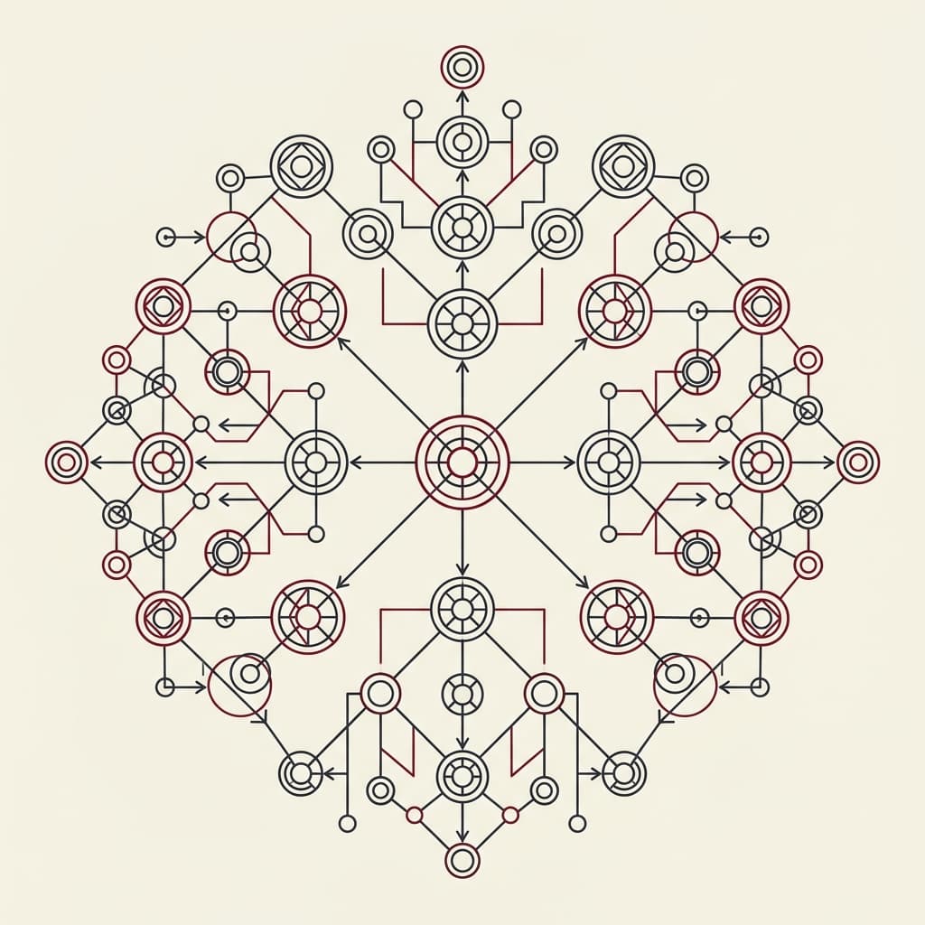
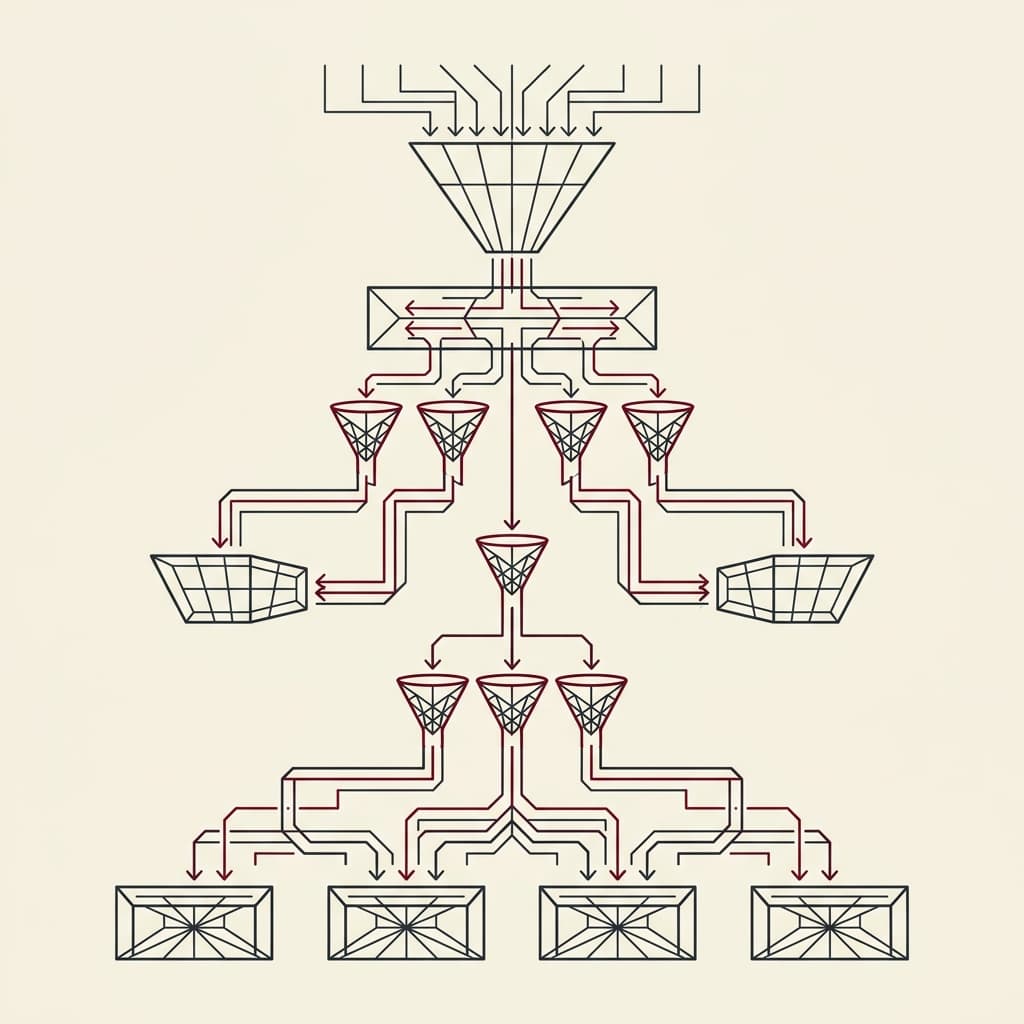
La marca como sistema: un núcleo (el ADN) que gobierna las tres identidades, y de ahí la marca que el público percibe. Arrástralo o ábrelo a pantalla completa.
The three identities: how the DNA becomes perceptible
The DNA isn't touched; it manifests. And it does so through three sensory channels, not one:
| Identity | Gathers everything the brand… | Includes |
|---|---|---|
| Verbal Identity | is read, heard, or spoken | the name (naming), the tone, the language, the sound, the phonosymbolism |
| Visual Identity | is perceived by sight | logo, color, typography, patterns, photography, packaging |
| Spatial Identity | is experienced in space, physical or digital | store, web and app, uniforms, social media, even the scent (the scent-mark) |
Seen this way, the famous logo is one element of one (the visual) of the three identities. Important, yes; but mistaking it for the whole brand is like mistaking the button for the product. Coherence doesn't come from the logo: it comes from all three identities speaking from the same DNA.
Why "system" and not "manual"
If the brand is a system, it should behave like one. Brand Engineering subjects it to four principles borrowed from engineering:
- Tokenizable — every decision (a color, a radius, a word we do use) is expressed as a variable named for its intent. Those are the design tokens.
- Composable — tokens generate components, and components generate experiences. You don't redesign every screen; you compose it.
- Verifiable — coherence validates almost on its own, not by eye in a Friday-afternoon review.
- Versionable — the brand evolves with version control, like code, not with a PDF v7_final_FINAL.
This isn't a loose metaphor: it's the same idea that underpins a design system (the tokens and components shared across the whole interface) and that connects to the way I build this website —Spec-Driven Development and Context Driven Development—, where the specification is the executable source of truth. A well-made brand is an executable spec of who you are.
In practice
Before touching a color or writing a headline, I ask the DNA: is this coherent with who the brand is and who it speaks to? If the answer doesn't come from the core, it isn't a design decision, it's an opinion. The system exists precisely so that opinions don't govern the brand.
The logo will keep mattering —it's the face people remember—. But it stops being the starting point and becomes what it truly is: the visible output of a coherent system. Design the system, and the logo —and the tone, and the store, and the app— follow on their own.